A minimalist monochrome illustration capturing the essence of autumn fruits
As pumpkins appear on market stands, school resumes, and cooler weather settles in, it's a perfect time for brands to shift their mood and visuals. Cosier, more comforting atmospheres take over, and color palettes turn richer—earthy tones, deep night hues, and velvety textures become center stage. Seasonal ingredients like mirabelle plums, figs, grapes, pears, and apples inspire gourmet creations during their brief availability.
This realistic food illustration offers a simple, elegant tribute to autumn’s harvest: a minimalist still life, as if just gathered from a fresh market basket. Figs, grapes, and blackberries stand out in striking, inky tones—some tinged with blue, others with hints of purple. The monochromatic treatment emphasizes the fruits’ natural elegance and authenticity, evoking the simplicity and beauty of the season.
From photography to illustration: translating visual codes
Did you notice that some parts of this drawing appear blurred? This effect isn’t digital—it’s created entirely by hand with pencil. Our eyes are used to reading photographs, where depth of field, focus, and soft or sharp edges guide our attention. I use these same visual cues in illustration to direct the viewer’s gaze—leading the eye across the fruits and drawing focus to the grape cluster. Interestingly, this technique existed long before photography, as seen in classical artworks like Vermeer’s, which I explore further in this article.
 |
 |
 |
 |
My digital pencil blur technique: step by step
Here’s a behind-the-scenes look at how I created this effect. I didn’t use any digital editing tools to achieve the blur; instead, I relied on traditional drawing methods. Most of my illustrations are made with a stylus on a tablet using Adobe Fresco—this approach comes closest to the feel of classic pencil on paper, my longtime favorite tool.
For soft, blurred edges, I skipped photo editing software and stayed fully within my hand-drawn style. I used a very broad pencil tip and limited myself to just a few strokes (with the Apple Pencil), keeping details to a minimum and focusing on lighting. I also constantly narrowed my eyes to better judge contrast and softness. The finished image has the same tactile, authentic feel as my sketchbook drawings.

When you look closer at the grapes—the sharpest part of the illustration—you’ll see my signature technique at work: building depth with multiple layers of fine pencil strokes over a colored base, skillfully varying both color and brightness. This pencil method allows me to capture even the subtlest shifts in light, suggest drops of water, and highlight the natural imperfections that make the fruit come alive.
Watch my video (in French only) to see how I create this photographic blur effect using only pencil techniques:
Seasonal artwork and food brand marketing
Culinary marketing is deeply shaped by seasonality—tables, cravings, and consumer expectations shift throughout the year, and so do the visuals on packaging and in campaigns. This presents both a challenge—how to keep things fresh every season—and a joy: the chance to celebrate each fruit and vegetable in a new way that stays true to your brand’s spirit.
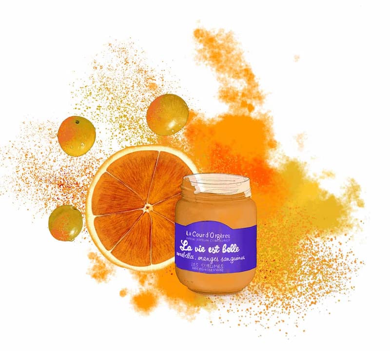
The value of a seasonal food illustration lies in its ability to instantly create a specific atmosphere. Here, I chose minimalism, elegance, authenticity, and a cinematic mood to elevate the illustration into the premium space. Of course, there are many other possibilities—in some projects, I might use bold colors, expressive lines, or loose watercolor effects, like in this illustration of mirabelle plum and blood orange jam:
In my food illustration process, these creative choices are always made during the initial briefing. My drawings aren’t standalone works of art—they’re custom visuals designed to serve your marketing objectives. I work closely with you to define the right angle for a piece that fits your brand while maintaining my signature realistic and elegant style, perfectly suited for premium and artisan food brands.
Coming soon: new projects featuring the beauty of mirabelles, chestnuts, and autumn pears.